I’m Joshua Sortino, a Miami + NYC-based Design Director, advisor, and investor. I will improve your startup’s user experience, design culture, and team. We should talk →


Designing for millions billions of commenters
Design Lead & Front-End Engineer · disqus.com · 2012 – 2014
Honestly the clearest explainer on this I’ve read. The section on local reporting budgets surprised me.
Same. I had no idea the numbers had shifted that much in five years. Would love a follow-up on how the smaller papers are adapting.
Counterpoint: the piece skips right over subscription fatigue. Most people I know already pay for three or four of these.
Which ones, though?
News, two streaming services, and a podcast app. It adds up.
Bookmarking this for our team meeting tomorrow.
Send me the notes after? Curious what your editors make of it.
- 2B+monthly visitors reached
- 4M+websites running Disqus
- 75%of the web’s 1,000 most engaged sites
Starting with the basics
Before storyboarding, detailed wireframes were created which demonstrated each possible use case of the commenting embed. These were used as a reference point for the team throughout the entire project.

Designing with stories
Disqus powers the comments on millions of websites and is viewed by over a billion unique visitors every month. Redesigning a product on this scale required careful planning and research. Before the design was built, storyboards were created to ensure every feature, persona, and use case was considered.

Designing a social network
The redesign of the commenting embed was also the introduction of Disqus as a social network. To design a social network, we focused on user personas and how the design will adapt to individual personalities. Profile cards, user profiles, and other features were introduced to enrich the community experience.
Adaptive, contextual design
Since Disqus is embedded on millions of websites, the design and engineering needed the ability to exist cohesively in any context. Font colors, font sizes, and backgrounds would automatically change to fit any website's aesthetic.

Josh is a standout product designer with a remarkable drive to see the big picture... He truly cares about users, perfecting his craft, and reaching to knock the mission out of the park.
Designing the Disqus dashboard
Project Design Lead · disqus.com · 2012
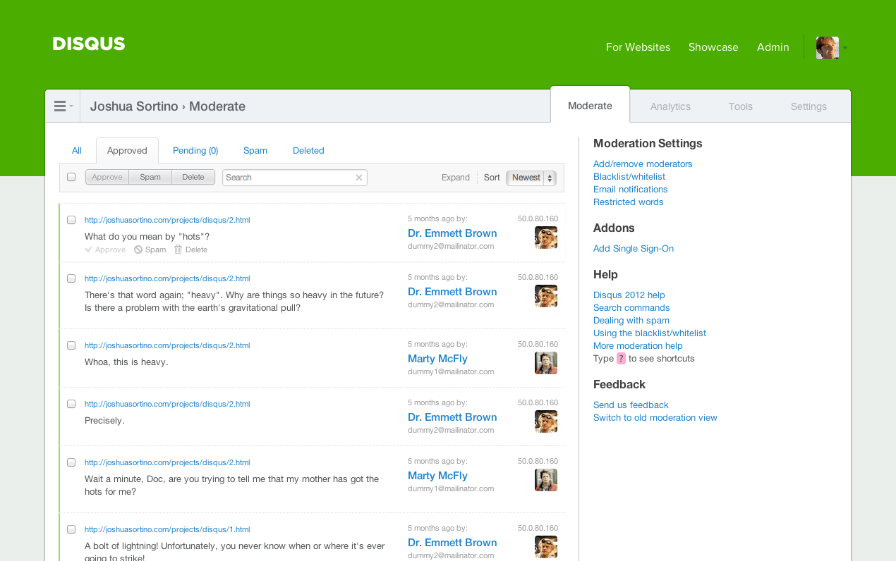
Identifying the problem
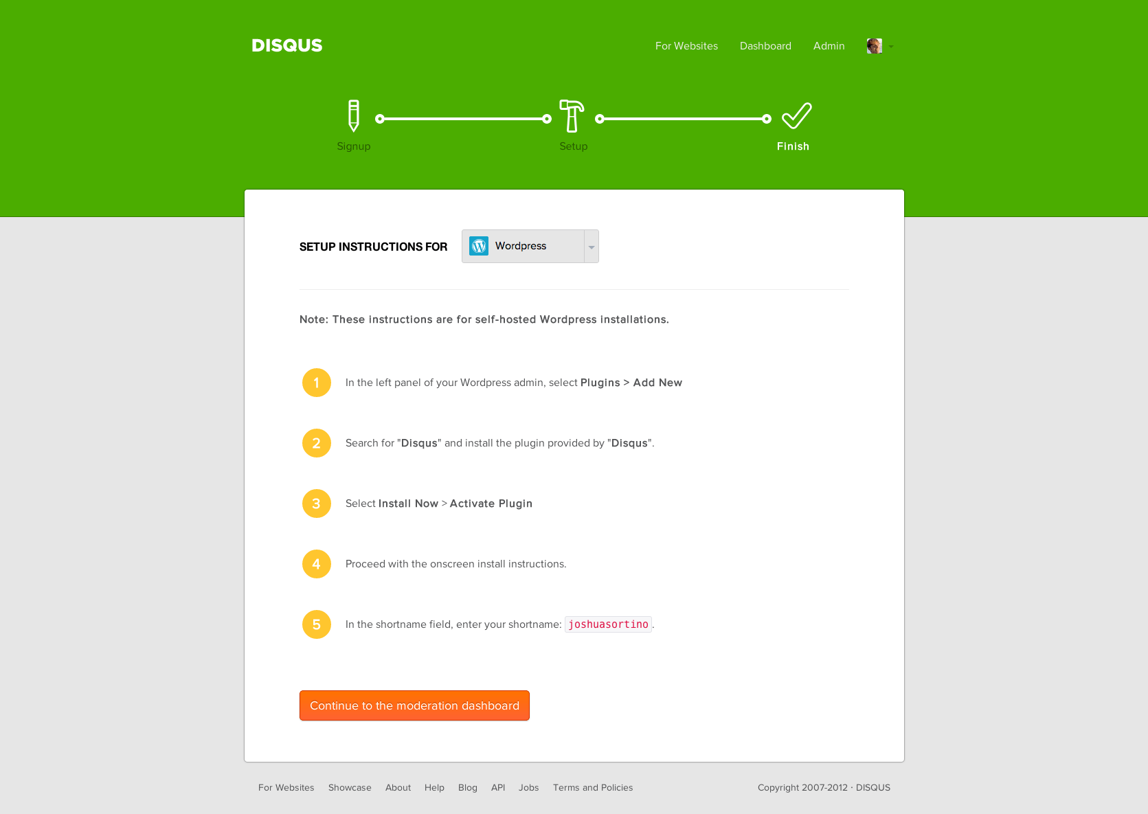
The original Disqus dashboard did not provide publishers with step-by-step instructions. Lack of clear next steps after completing the initial sign-up process resulted in high drop-off rates.
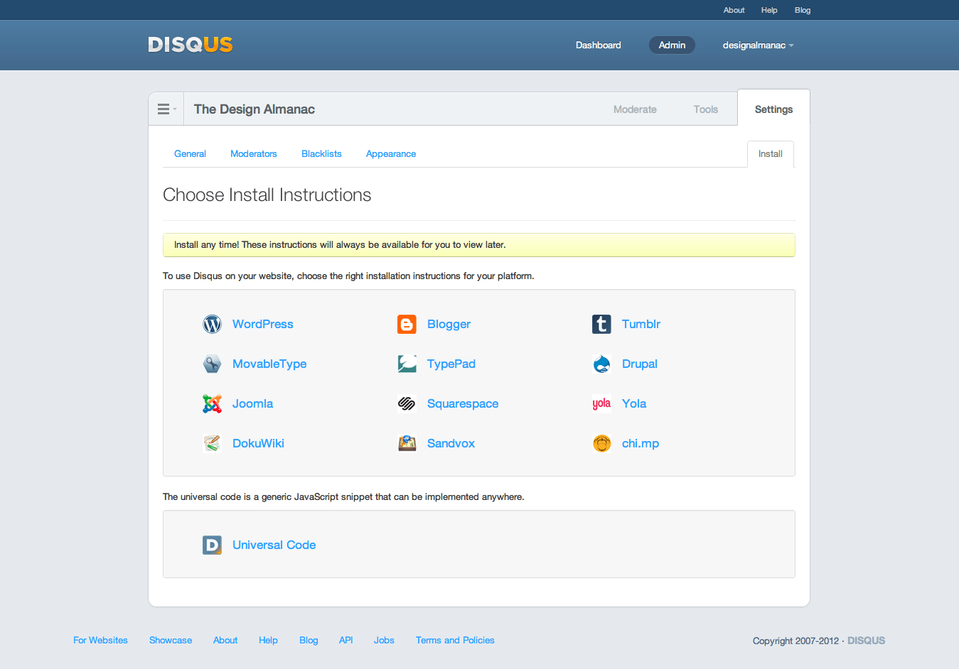
Original dashboard (before redesign)



Exploring options
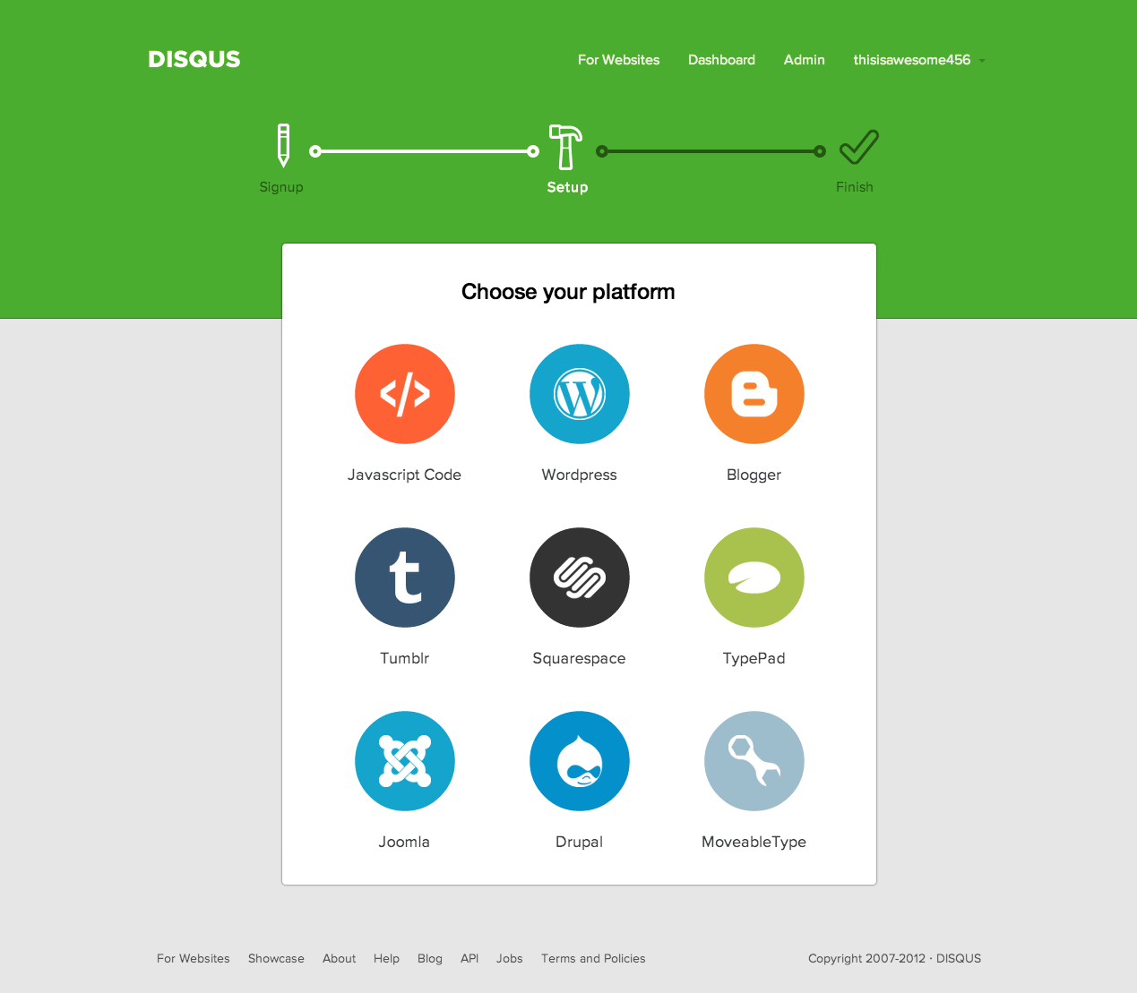
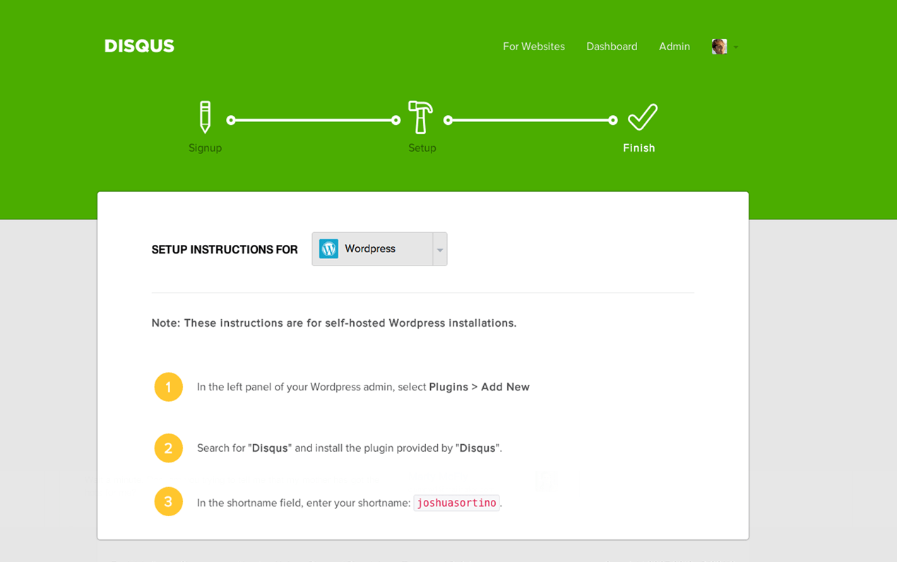
To solve the problem, designs for a clear step navigation indicator were explored. Additionally, the visual design was reworked to improve focus by removing clutter.
Hiding unnecessary details
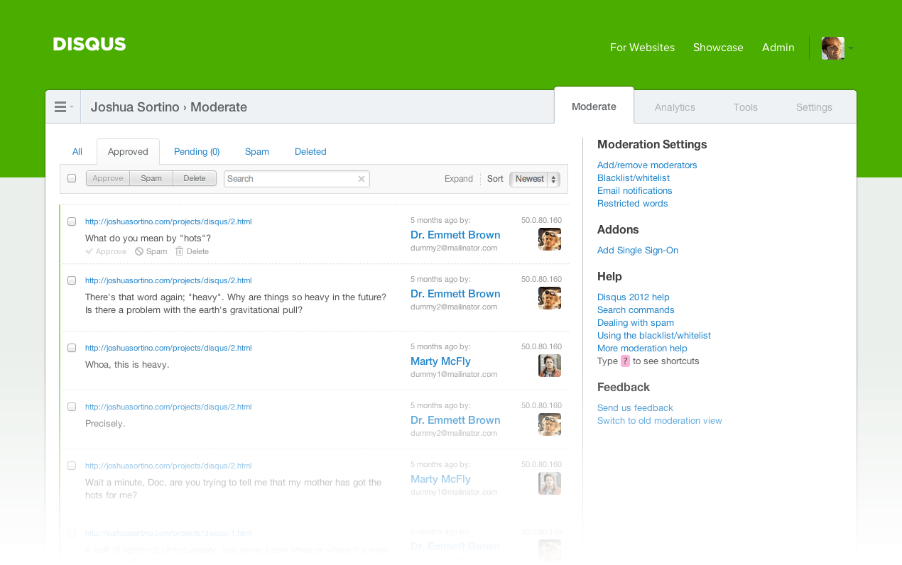
With the original dashboard design, notifications cluttered the initial onboarding steps. By moving notifications into the menu, only the essential items are visible.
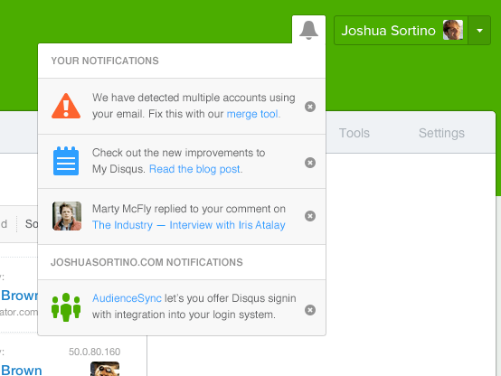
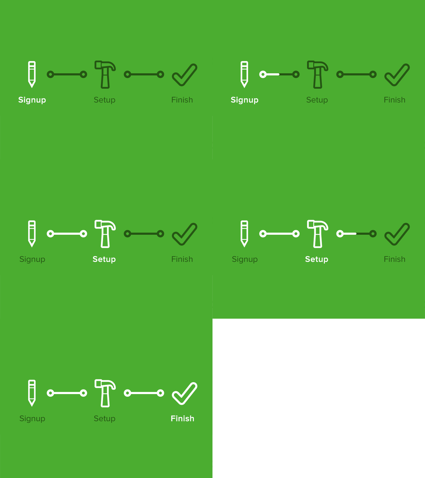
Presenting the solution
The final design solution for the steps navigation was conceptualized and animated for testing with real users.
Implementing the final designs
First draft wireframes were sketched on whiteboards before final designs were integrated directly into the dashboard codebase. Analytics software was used to monitor user flows and verify a 33% increase in sign-up completion with the updated onboarding design.