I’m Joshua Sortino, a Miami + NYC-based Design Director, advisor, and investor. I will improve your startup’s user experience, design culture, and team. We should talk →


Redesigning the digital grocery cart
Design Lead · Contract Project · instacart.com · 2013
- 10×revenue growth in 2014
- $2Bvaluation by Dec 2014
- 10US cities by mid-2014
Identifying the problem
In real-life experiences, customers can view their shopping carts while browsing products, which is ideal when using a shopping list. Because Instacart's shopping cart overlaid on top of (and obstructed) the browsing view, Instacart needed to redesign their shopping cart interface.
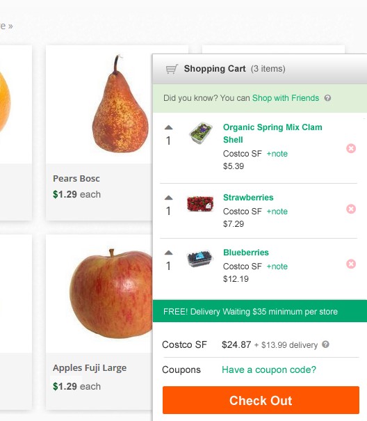 The cart covers what you’re browsing
Introducing a solution
To solve the problem, a sidebar sliding cart was designed, allowing customers to browse without obstruction. At any point while shopping, products are visible to the customer.
Dissecting and comparing the original design
The project started with a critique and review session of the original design. New ideas and features were sketched on whiteboards before the wireframing process began. After wireframes had been agreed upon, detailed visual concepts were designed for implementation.
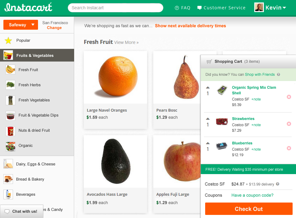
Original design (before)
Dated button styling
The glossy orange buttons on the store picker and checkout looked dated and competed with the products for attention.
Obstructing the user's view
When the shopping cart is expanded, the shopping experience was nearly unusable.
Too few items in view
The shopping cart displayed too few products to allow customers to make educated decisions when checking out.
Redesigning the cart around browsing
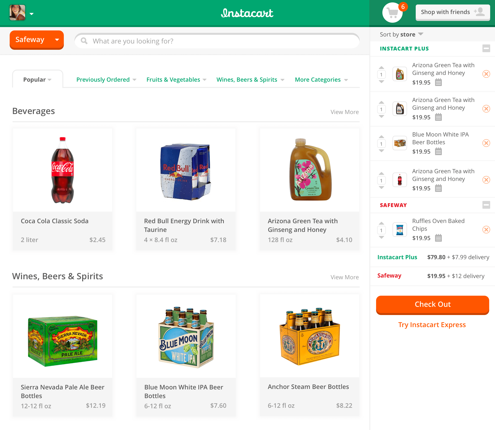
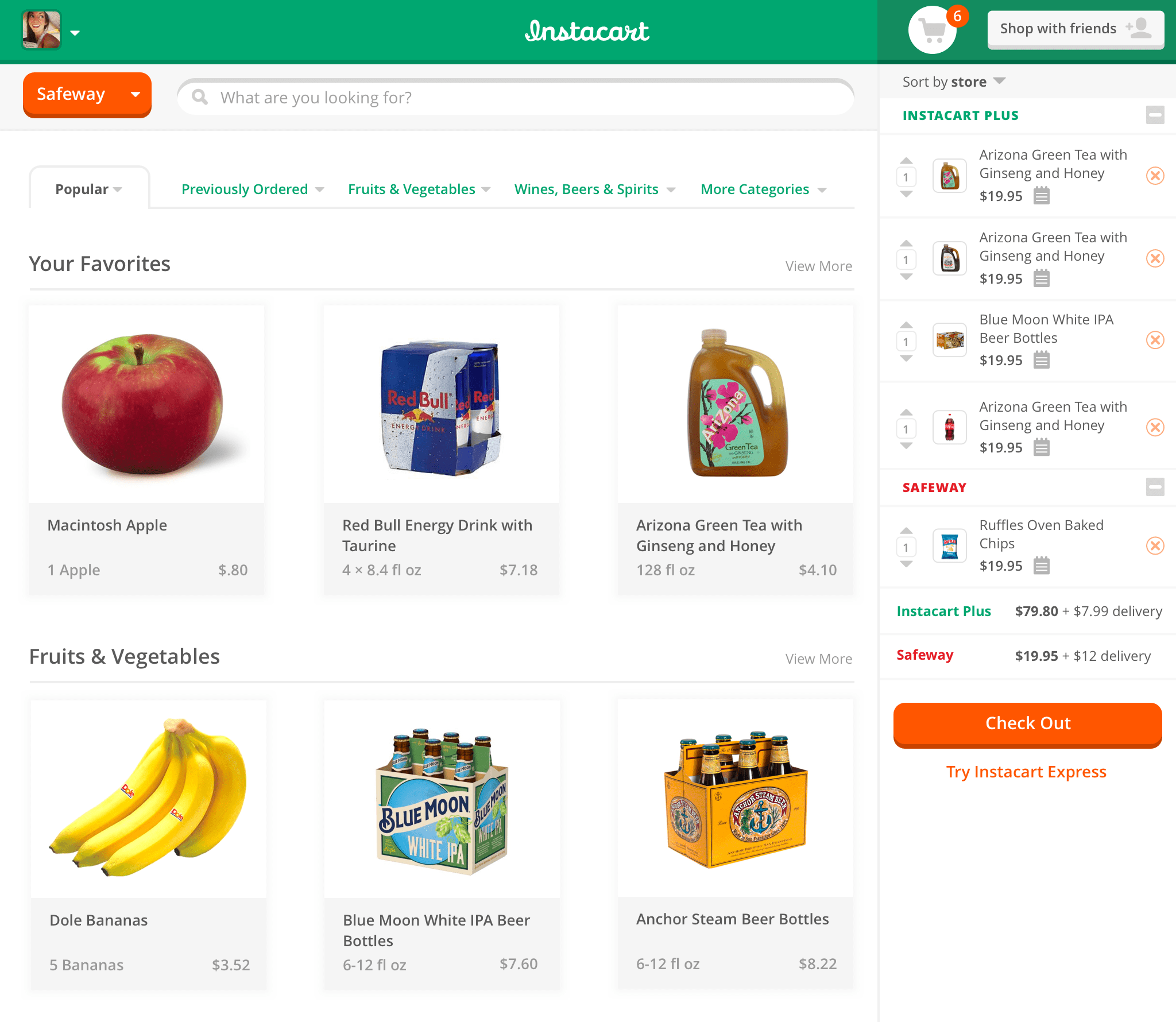
The redesign drops the overlaying cart. Browsing gets the full width, with more products in every row, and when the cart opens, the page reflows around it instead of hiding behind it.
New design (after)
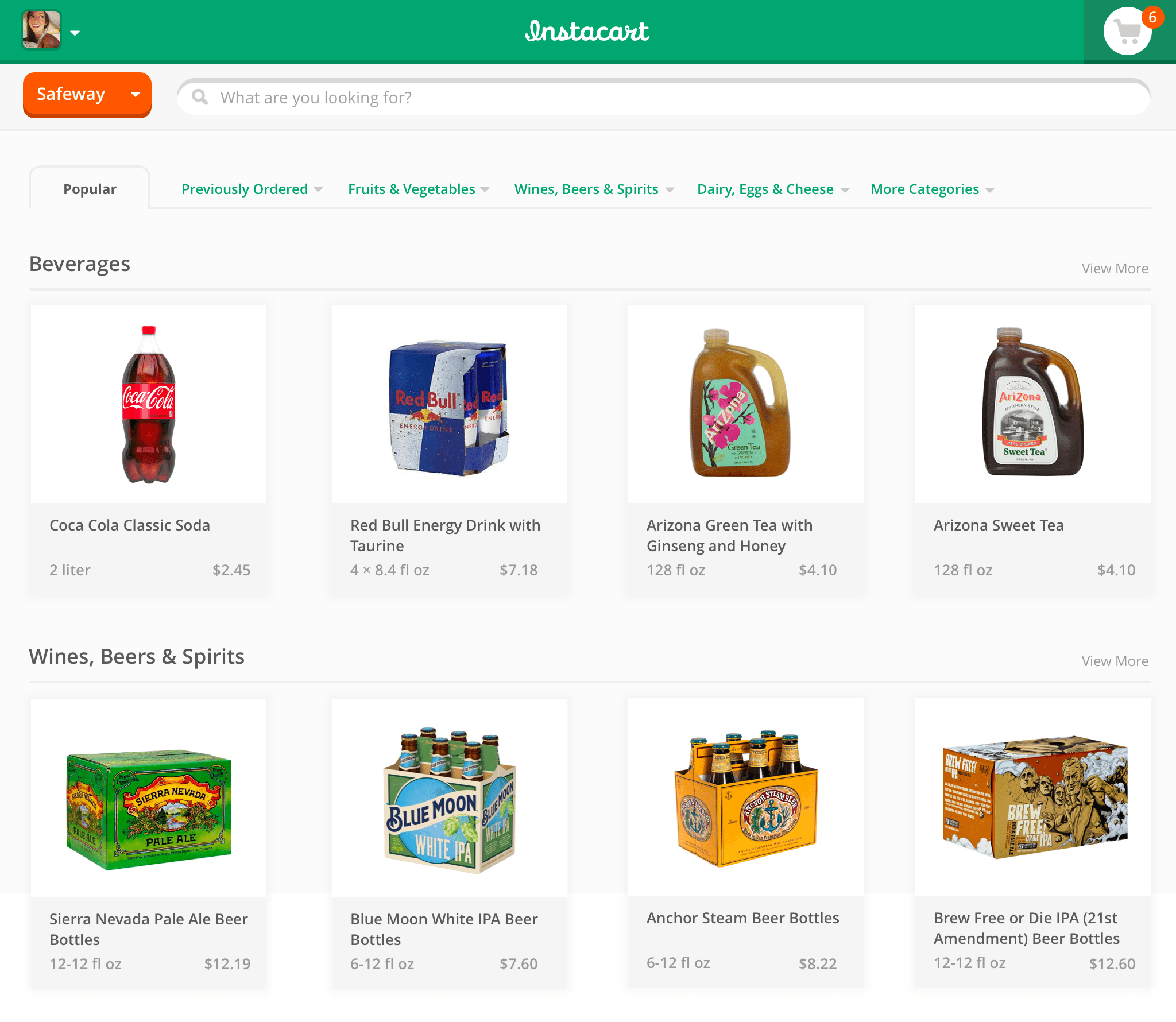
More space for products
Without a sidebar or overlaying shopping cart, the browsing view displays more products per row.
Expanded shopping cart
Reflowing content (never hidden)
When the shopping cart is expanded, content is reflowed (preventing the shopping and browsing view from disappearing behind the interface).


