I’m Joshua Sortino, a Miami + NYC-based designer, advisor, and investor, and I will improve your startup’s user experience, design culture, and team. We should talk →


Designing the Disqus dashboard
Project Design Lead · 2012

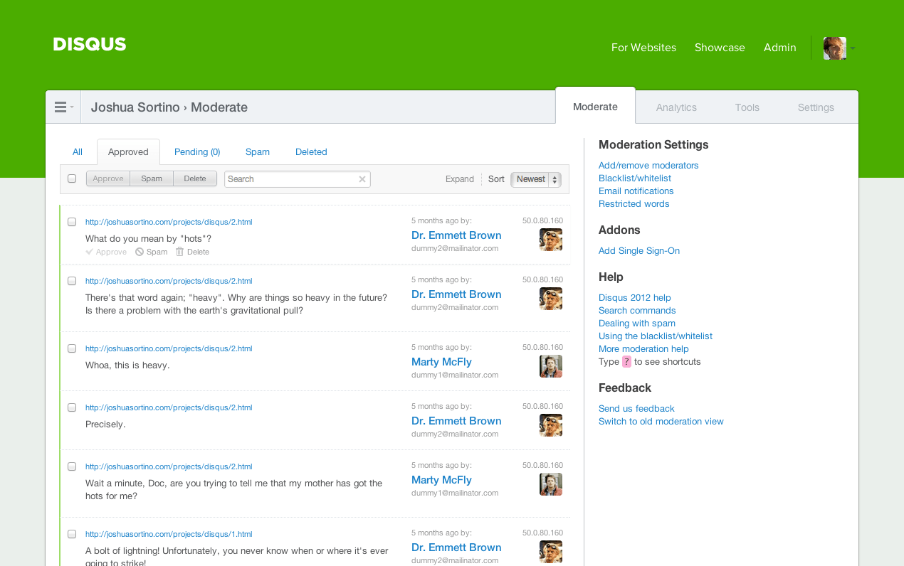
Identifying the problem
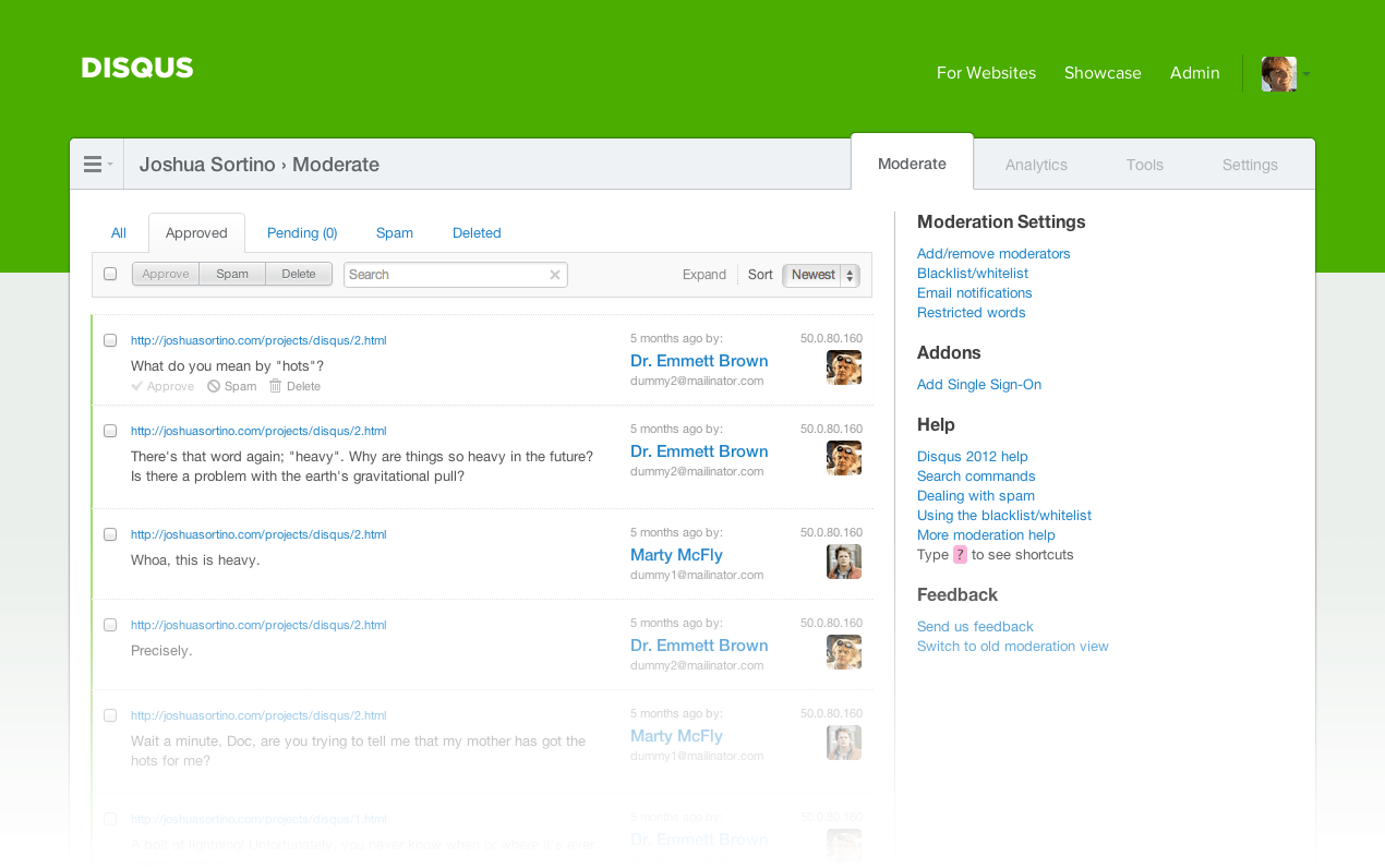
The original Disqus dashboard did not provide publishers with step-by-step instructions. Lack of clear next steps after completing the initial sign up process resulted in high drop-off rates.
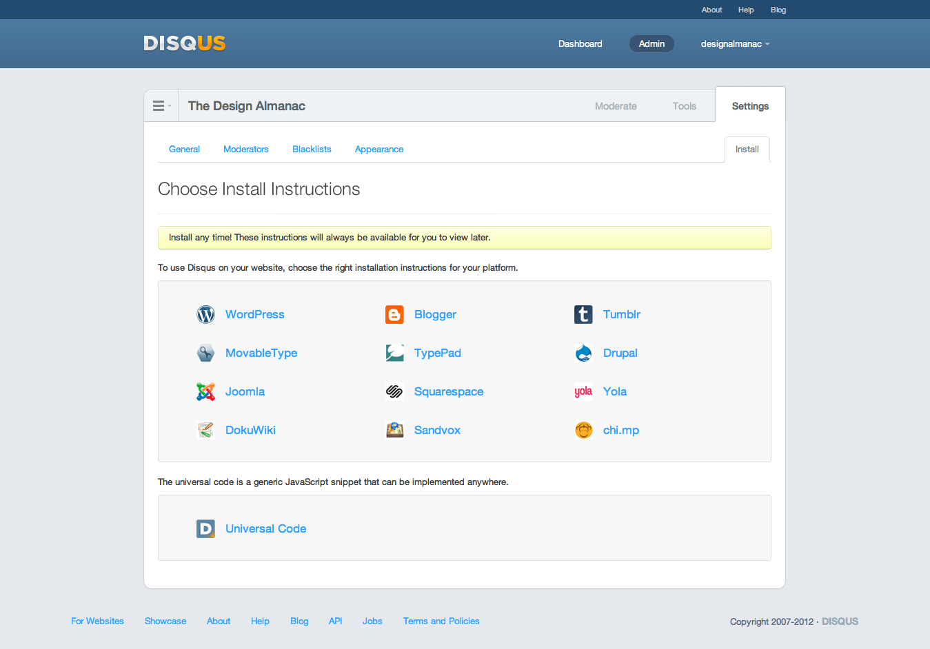
Original dashboard (before redesign)


Exploring options
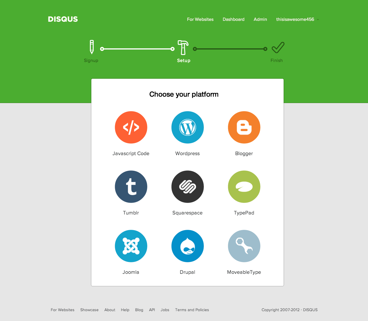
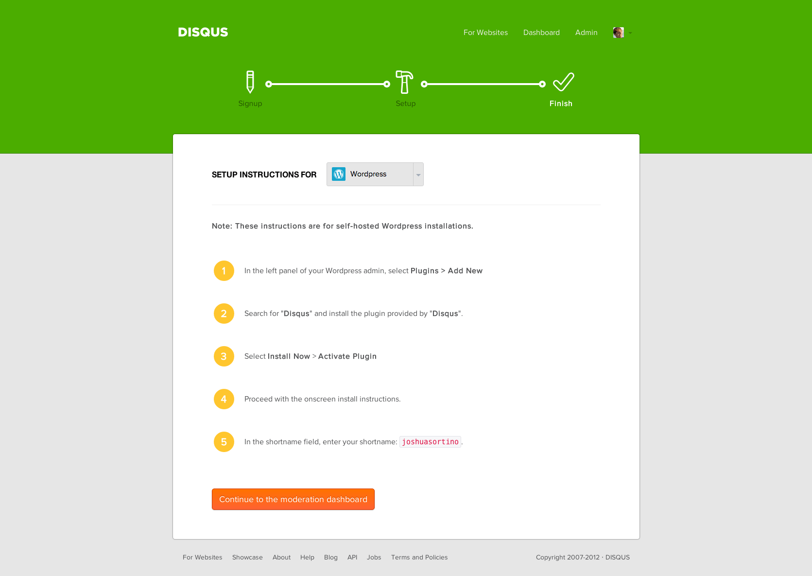
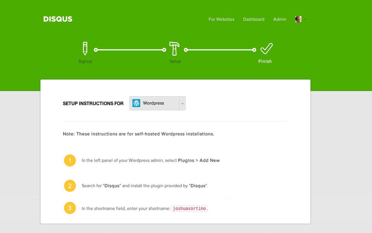
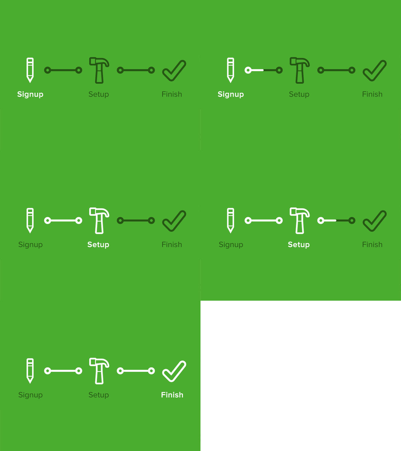
To solve the problem, designs for a clear step navigation indicator were explored. Additionally, the visual design was reworked to improve focus by removing clutter.
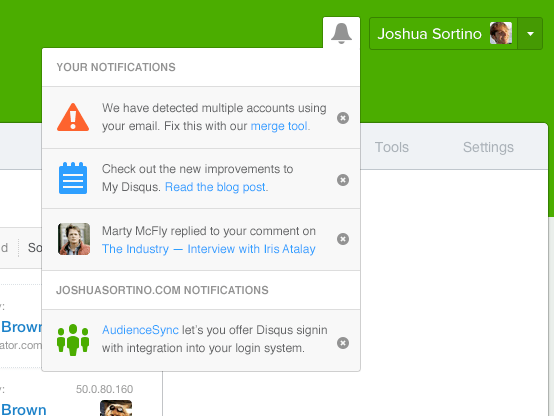
Hiding unnecessary details
With the original dashboard design, notifications cluttered the initial onboarding steps. By moving notifications into the menu, only the essential items are visible.
Presenting the solution
The final design solution for the steps navigation was conceptualized and animated for testing with real users.
Implementing the final designs
First draft wireframes were sketched on whiteboards before final designs were integrated directly into the dashboard codebase. Analytics software was used to monitor user flows and verify a 33% increase in sign up completion with the updated onboarding design.
