The Current State of Design Leadership
How to Get Funded Without a Working Product
How to Hire a Designer & Build a Design Team
14 Things Learned Designing at Disqus
The Start of a More Consistent iOS Design
Savoring First Experiences
How to Create a Responsive SVG
If you’ve read some of my previous entries, you probably know I’m in love with SVG. Browser support is quickly improving and more websites are using SVGs for increased flexability. Many vector graphics software apps provide tools to export vectors as SVG images. Unfortunately, most of these tools do not provide options for a truly scalable, responsive SVG. In this tutorial, I’ll demonstrate my method for creating a responsive SVG. (My demonstrations will feature Illustrator, but the outcome can be achieved with most vector editing software.)
While creating your illustration, try to avoid using special effects and filters (unless you know what filters are supported by SVG). Graphics with simple lines will translate better than complex vectors. Since some browsers use different SVG rendering engines, the simpler the image, the more consistent it will display across all platforms.
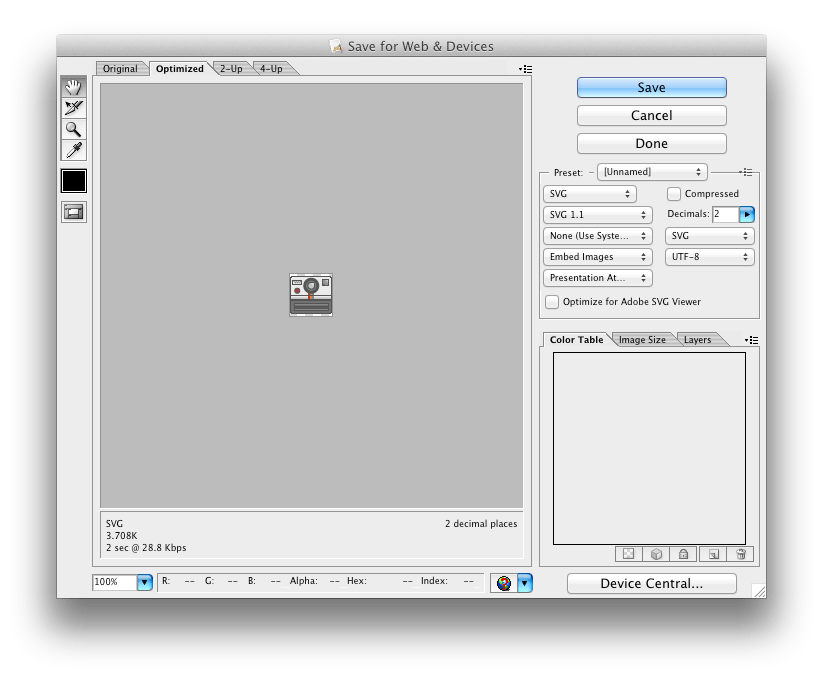
In your vector editor, export your graphic as an SVG image. For Illustrator, go to File > Save for Web & Devices.

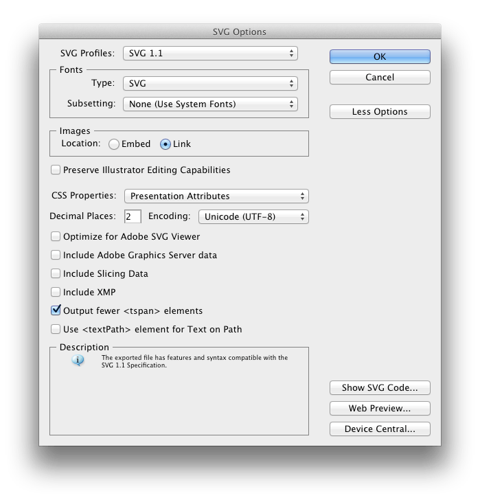
Most vector editors will provide advanced options. For clean code, I prefer not to go beyond two decimal points. For more accurate lines, this number should be increased. Once you’re satisfied with the settings, save your graphic.

If you’re using Illustrator and the proper settings were configured, you’ll notice an HTML file was also generated. If so, just ignore or delete that file. We’ll be writing our own embed code. Here’s the markup I use to reference my SVG images inside my index.html file.
<object data="camera-icon.svg" type="image/svg+xml" class="chart">
        <a href="camera-icon.svg">
            <!--[if lte IE 8 ]-->
            <img src="camera-icon-fallback.png" alt="Icon">
            <!--[endif]-->
        </a>
</object>
You’ll notice I defined a fallback. This is generally a good idea for older IE browsers (otherwise a blank box will display). Also note my inclusion of the class “chart”. This will be used to set the flexible width of the SVG image.
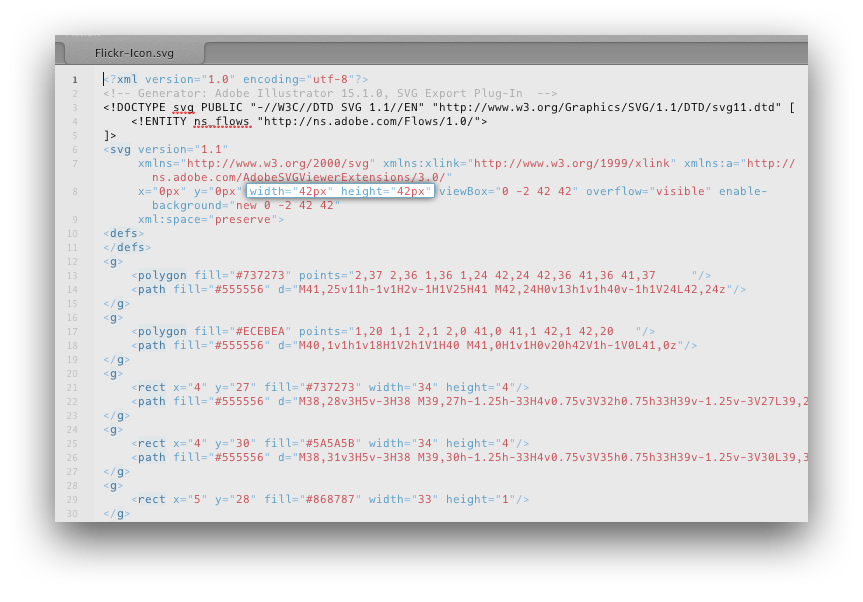
At this point, your SVG should be displaying in your browser. You might have noticed the width and height are not flexible but rather static. To fix this, we’ll need to open the SVG file in a code editor. In this example, I’ll use Espresso.
In the SVG declaration after the doctype, simply remove the width and height attributes. This forces the browser to always fill the containing DIV or box with your SVG.

Now, add the class .chart to your CSS and define a flexible percentage width. For demonstration purposes, I’ve set the width to 100%.
.chart {
    width: 100%;
}
If done correctly, the SVG image will fill the entire width of the viewport when viewing index.html. Of course, you can now place .chart inside of a parent element to fill the parent.
If you found this tutorial useful, let me know on Twitter.
